Skip to content

That 70’s Bathroom

That 70’s Bathroom published on

photo

As in vogue as pink bathrooms are nowadays, the same doesn’t really hold true for olive, does it? I mean, it’s a nice enough color but olive kitchens and baths just don’t stand the test of time. Is it because they’re more 70’s than 50’s? Will they ever come back? Who knows? Mom jeans and frosted hair are in….well, the kids are wearing them….or was that like 2 years ago already?

Anyway, this bathroom was in my mom’s friend’s house in Staten Island. Italians. That’s a mirrored shower door so you can watch yourself pee. I like the location of the bidet just across from the toilet. You can save time in the morning and brush your teeth while you’re taking a dump.

Built-In Corner Closet

Built-In Corner Closet published on 2 Comments on Built-In Corner Closet

IMG_0385

First of all, please excuse my inferior quality iPhone image. Ok, now that that’s out of the way, this corner built in closet is in FDR’s home in Hyde Park, NY.

There are built-ins that take up entire walls or a good portion of the room but this corner design would fit nicely in a small room. Looks easy enough to build from scratch (for a carpenter, not moi) but I’m wondering if one can come up with the perfect salvaged materials to do this. It’s game on for me because I have some tiny bedrooms in the new house and I think I wanna go with the corner thang.

Shower Stalls

Shower Stalls published on 2 Comments on Shower Stalls

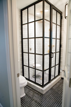
Love these “French” shower doors from Peppermint Bliss. She didn’t say where she got them from but word on the street is that you can use factory windows to achieve this look (which is probably what is shown in the picture).

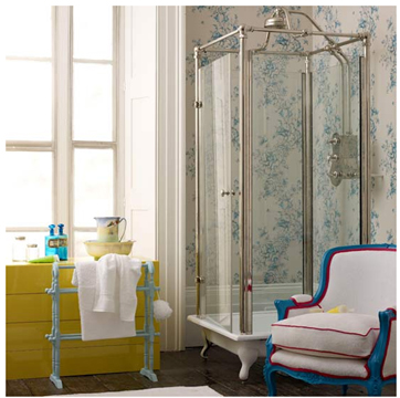
Clawfoot shower base with new chrome “antique” enclosure. Via Little Green Notebook.

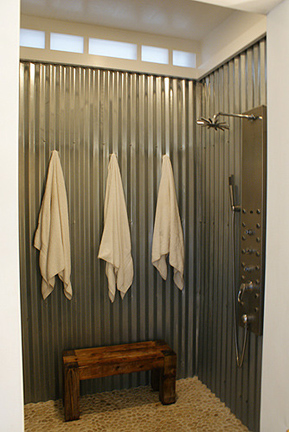
Corrugated metal is showing up everywhere these days. Via Apartment Therapy.

These reclaimed windows are a nice concept but you would want to seal them up before using them in your shower. Via Apartment Therapy.

Refacing Furniture

Refacing Furniture published on 2 Comments on Refacing Furniture

Hey kids! Here are more ways to save those pieces of furniture from the landfills. Plus, your friends will envy you for your kick-ass creations!

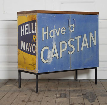
Idea #1: Plaster some vintage signs on that sh*t.

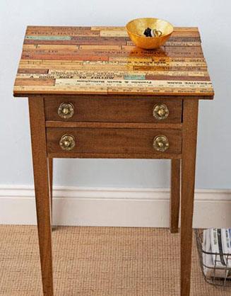
Idea #2: Old rulers and yard sticks! I’ve made frames and small pieces from rulers but never thought to do an entire surface. Pretty cool.

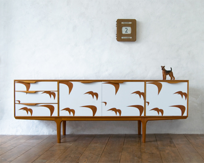
Idea #3: Laminate. Gorgeous laminate. I wouldn’t even know where to find stuff like that.

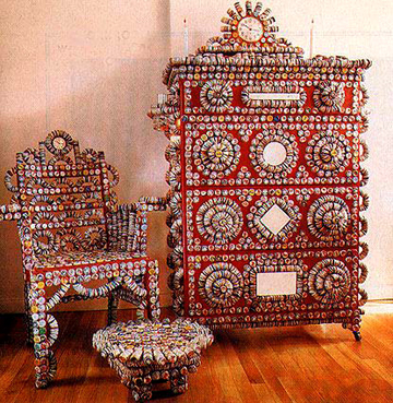
Idea #4: Got time on your hands? Bottle cap it.

Decorating Doors

Decorating Doors published on

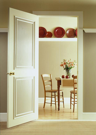
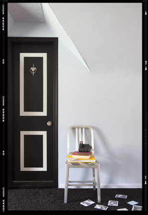
Got a bunch of plain doors you don’t really want to replace? Fancy them up instead of removing them. Start with a colorful paint and some antique hardware and go crazy with other techniques.

Ok, so the door above is actually a beautiful antique door to begin with but you can use chalkboard paint on any door. Mount an old frame or some molding around the chalkboard.

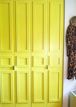
Create your own panel door. Do as many panels as you like. Whatever width of molding you want. Personally, I find mitering to perfection a bit difficult, but the good news is that there are ways to cheat.

This is a great fake-out. That door just has painted panels. No carpentry involved! Oh my, it doesn’t get any easier than that.

These panels were made from pre-cut artist stretchers that interlock. Miter schmiter.

Don’t forget that any of these techniques can be used on kitchen cabinet doors as well.

Groovy Stairs

Groovy Stairs published on

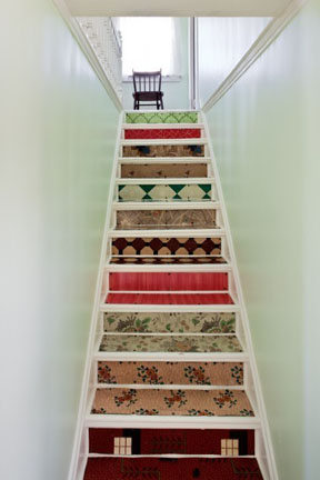
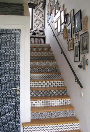
Howzabout some ideas to spice up those steps? These can be done without rebuilding your whole staircase.

Lovin’ the vintage linoleum stairs but it’s hard to come by real vintage lino these days.

Soda crates! Or choose any kind of crate you can get your hands on. Notice how they just inserted the reclaimed treads in the middle without messing with the bannister?

These are actually porcelain tile. They fooled me. I thought it was stained or faux painted wood. The Italian tiles are awesome but they may be pricey and hard to come by. Nothing wrong with using the real thing. Just sand and stain.

Oy. That seems like a ton of work. Not to worry. Cut the risers and stencil them on a table BEFORE installation. Still a ton of work but at least you won’t break you’re neck.

Design-A-Kitchen

Design-A-Kitchen published on 2 Comments on Design-A-Kitchen

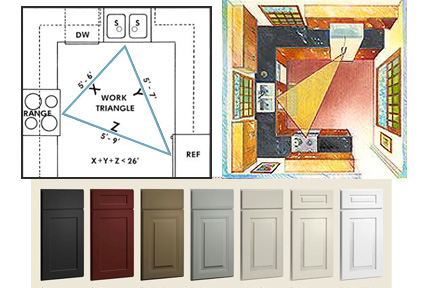
New advertiser alert! Show Cliq Studios some love and visit their awesome page for tips and how-to’s. Then buy some kitchen cabinets from them.

Seriously, it’s not a simple task to plan out an entire kitchen. As much as I love to use recycled materials, if you want a specific layout and design consistency, it’s best to go with brand new cabinetry.

The Cliq website has a remodeling guide for first timers. It starts out with design principles and covers layout, budget and everything up to installation. There are designers available to chat if you get confused.

Personally, I’m liking the painted cabinets. In particular, that black and the sage are pleasing to my eye.

A black kitchen. Dude, that’s so goth.

Upcycled Etsy Finds

Upcycled Etsy Finds published on 1 Comment on Upcycled Etsy Finds

There are only 53 days left until Christmas! And Hannukah starts even before that! Here are some lovely upcycled Etsy pieces for the home.

The garden faucet wine stopper from All Things Reconsidered is less than 15 bucks ($14.99 to be exact).

Howzabout a wall clock for that cyclist in your life? $149.99 from Upcycled Bicycle. Say that 10 times fast.

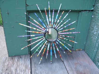
Swimming Deep created this starburst mirror out of recycled magazines. $25.

Chic Retro makes pillows out of old sweatshirts. You can send her your favorite old shirt and voila…a pillow! $19.99

Recycled Sukkahs

Recycled Sukkahs published on


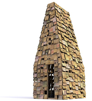
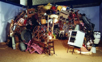
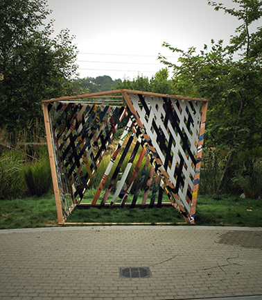
Sukkot begins tonight. For those of us unfamiliar with this Jewish holiday, it just means that alternate side parking rules are suspended this Thursday and Friday (Woot!). Sukkot is the shed holiday. Yeah, NOW you know what I’m talking about!

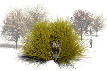
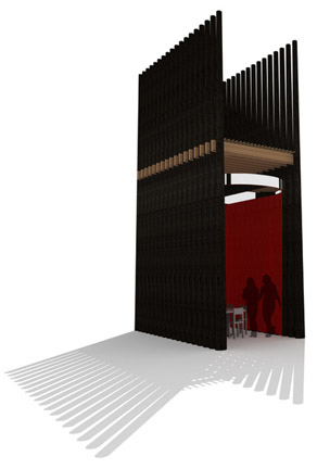
According to Rabbinical code, the sukkah (shed) cannot be located under trees, Stars must be visible from the roof, which  must be made of material that is cut from the earth. For a better explanation, please visit the Babak Bryan website. They are the guys who created the Fractured Bubble sukkah above. The bubble is not really made from recycled materials, but rather invasive species that were picked from local wetlands. The design won People’s Choice in 2010’s Sukkah City and I love it too much not to include it.

Each image links to more info on that particular sukkah.

Past Sukkah post.


DIY Fun with Plastic

DIY Fun with Plastic published on

IMG_6399

Yes, I’m a ho for Plastics Make it Possible. Those dudes along with Ogilvy PR sent me down to the Solar Decathlon and the inspiration I got from these kids in the competition is the gift that keeps on giving.

IMG_6401

Ok, so check out the light fixture used in the Purdue University home, which BTW, took second place. Not too shabby. I don’t know how much they did from scratch, but if they started with 4 pendants and built the lucite shade, then they would have built the frame and drilled holes in the lucite to attach the bolts. I’ll bet you can find something similar with a clear shade. The beauty of this is the sand. Yes, that’s just sand.

All you have to do to make one of these babies is tape the edges and find a clear, non yellowing adhesive. I’m guessing a spray adhesive would work brilliantly. But here’s the thing. Why stick with beige? You can do any color sand. Make it a red light, Roxanne. Or!! You don’t even have to stick with sand. What about recycled glass? Recycled multi-colored plastic bottles and such on the outside of the lucite? Or recycled crazy straws? That’s crazy fun! Use heavier glue for these. Are you getting the picture?

IMG_6392

The LED backlit panels used by Appalachian’s Solar Homestead rocked my world. They weren’t the only ones to use these acrylic sheets to set mood lighting, but they were the only ones I got a picture of. Seems an easy enough project. Run your lights and cover them with translucent plastic sheets. Get creative with it by framing and hanging “light boxes” instead of covering the entire wall.

IMG_6424

The back splash above was in the City College of New York Solar Roof Pod. (Woot! Woot!) To be honest, I didn’t catch what the materials are. I’m going to guess that it’s Corian or another acrylic solid surface material with glass inlays. Easier and less expensive than buying a sheet of Corian would be to make a resin backdrop and set in the accents instead of cutting into the piece. Remember that you can work on a horizontal surface and hang it once dry. If you’re going with resin, the possibilities are endless. I happen to love the clean look of this one, but remember my resin countertop? It could easily be a backsplash.

So, there ya go. Tomorrow I’ll show you some fun wood projects. But just one more word on plastic. I could not have made it through the rainy weekend without the following two items keeping my feet and pants dry. So, thank you again, plastics, for making it possible to stay comfortable on the nastiest of nasty days.

IMG_6405

IMG_6404

Solar Decath Part I

Solar Decathlon. And the Winner Is…

Solar Decathlon. And the Winner Is… published on 1 Comment on Solar Decathlon. And the Winner Is…

IMG_6340

It’s not often I get a fun AND informative expense paid weekend. Once again, thanks to the Plastics Make it Possible campaign for inviting me along to the Solar Decathlon in DC. I was honored to be included among such bloggers of awesomeness as Jetson Green, Dwell, Shawna Coronado and Ugly Duckling House .

The weather wasn’t exactly cooperative, but we struggled through it like troopers. The first home we toured with Brooks Utley was the Caltech Compact Hyper Insulated Prototype or CHIP. I’m not gonna lie. The interior was nice, but this house was alllll about the exterior for me. Anything that looks like a space ship is fabnificent in my book. The CHIP does not have any insulation, not because they are from sunny California and don’t need it. It’s because that funky puffy “siding” acts as the outsulation, a word they are trying to get into the dictionary. CHIP’s skin is made of heavy-weight (24oz/yrd) recycled white vinyl. White was used to reflect as much of solar radiation as possible, reducing cooling load. The “siding” is highly durable and waterproof.

IMG_6419

Florida International University also had an impressive exterior. Their perFORM[D]ance House has layered walls designed to protect the house from undesired elements. Check out their website for energy performance on the walls and windows. It’s the louver system I want to discuss. The PVC and aluminum panels shade and protect the house as well as provide hurricane protection. Looks a bit nicer than the plywood or duct tape people were using here for Irene, no?
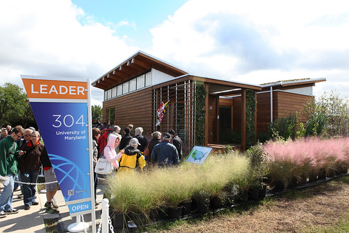
University of Maryland First Place in Solar Decathlon

The winner of the 2011 Solar Decathlon was the University of Maryland with their Watershed project. They best utilized sustainable design for running the entire house.

IMG_6368

Check out the home’s control panel with an easy button thrown in for good measure.

IMG_6360

The dehumidifier is a work of art. The Innovative Liquid Desiccant Waterfall (LDW) system was developed by Maryland’s 2007 LEAFHouse team. A high-saline solution absorbs humidity from the air as it falls through back lit plastic “jellyfish”. It’s beautiful AND smart.

bwIMG_6379

My personal favorite was New York’s Parsons School of Design. Not because I’m partial to NY (I am). Not even because I thought the house had the best overall design. It’s the story behind it that I fell in love with. The EmpowerHouse is a Habitat for Humanity home and of all the houses we toured, this one felt like a HOME. It’s probably because the lucky family who are inheriting the house were there on hand. Their photos were on display. This was actually someone’s home and I got a little verklempt when I met them.

IMG_6385

My own honorable mention and the winner of the People’s Choice Award is Appalachian State’s Solar Homestead. Whereas some of the entries felt a bit cramped, this home had space and style. Once again, it was the exterior that blew me away.

IMG_6388

The modular porch with outbuildings is kept dry by a bifacial PV canopy that acts as a net zero energy source for the home. The technology allows each 195 watt panel to collect sunlight bounced from below as well as above.

IMG_6391

But honestly, the had me at the bark siding. Yes, this is durable and water resistant as long as it’s not sitting in a flood zone. The bad news is that it’s expensive.

Tomorrow I’ll fill you in on some other innovations I saw and easy DIY techniques we can steal for you kids to try at home. The bark included. Yum!


Modernizing Raised Ranch Exteriors

Modernizing Raised Ranch Exteriors published on

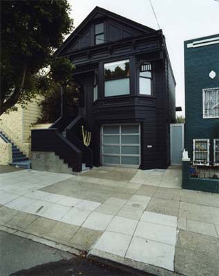
The problem with raised ranches is that they look dated. Those 1970’s-1980’s models are about as stylish as that old Flock of Seagulls haircut. The good news is there’s always a way to change the look of any house. The bad news? It’s hard on the pocketbook. The good news? It’s less expensive than buying a new/old dream home.

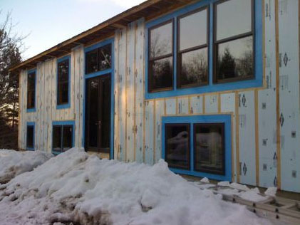
The house above is actually a renovated raised ranch. I’m no architect, but this completely modern look probably means lifting the roof. Forget the deck thang because it’s not compatible with most split levels. Just picture the upper story with all windows.

Instead of going with contemporary, how about stepping back in time? This raised ranch was built in the 1950’s but that doesn’t mean your 1980’s home can’t rock the mid-century look.

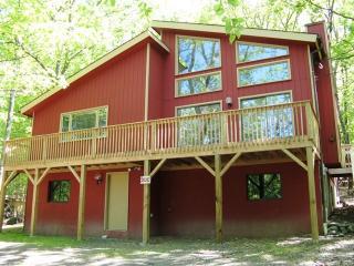
Howdy! How about “barn style”? Paint it red, slap a front deck on it and yee-haw, you’ve got yourself a rustic abode in the burbs.
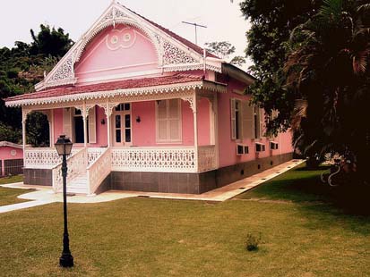
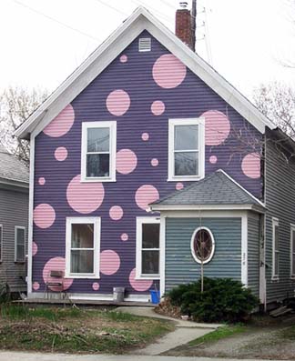
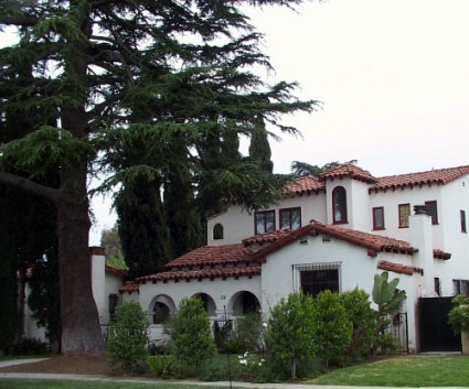
No, this isn’t a raised ranch but it’s the closest image I could find to a stucco home. Stucco comes in any color, so you can have a pretty pink stucco ranch if your heart so desires.

Fine Homebuilding did an article on how to get rid of that raised ranch overhang. Think about it, without that, the house could take on any look you want. With some recycled brick, it can look like the house below.

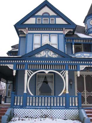
I didn’t find any Victorian splanch photos, but with some wood siding, a porch and detailed trim, you got yourself a Painted Lady Victorian!

Click on the images to get more info on each house.

Updating Raised Ranches. Part I

Primary Sidebar