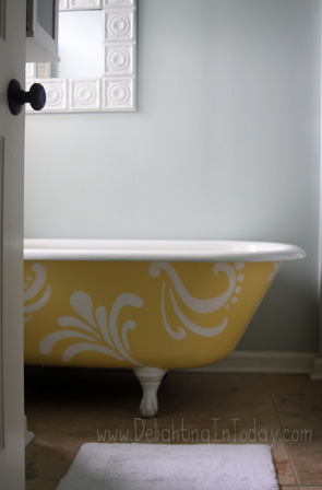
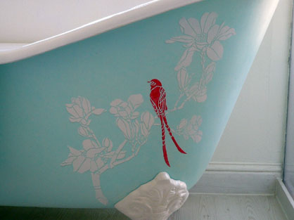
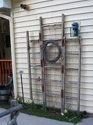
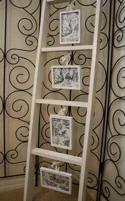
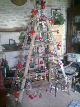
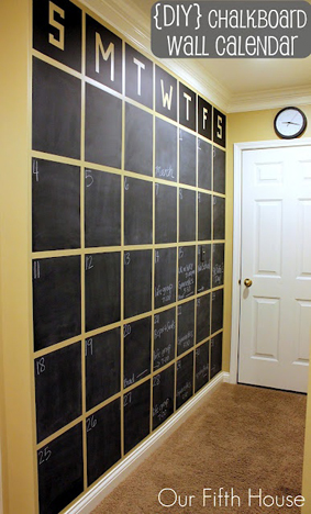
Could have been larger print but these are the stencils I had in the house. The dusty footprints are a nice touch. Dontcha think? Yes, I was working barefoot.
Posts categoriezed as Design
Cabinet Interiors
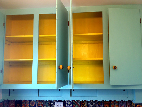
The kitchen cabinets that remained in place during the entire renovation got a fresh coat of paint on the outside. But ah, the interiors were still nasty. They were skimcoated and primed but that still wasn’t doing the trick.
Why yellow gloss? I had it in the house. It looks soooo much for fabulous than boring ole’ white. And it totally goes with my Mexican theme.
Oddly enough, I came home last night after painting and prepared fajitas for dinner.
Apartment Two
The Rockaway upstairs apartment is now ready for it’s (not so) close up! The original goal was to start showing by the end of May. (The original original goal was to have the house sold by the end of 2012, but we all know how that worked out.) Ok, so this new deadline was somewhat delayed due to the fact that I mistakenly decided to have a life and go away for Memorial Day weekend. But whatev. I’m back up to speed.
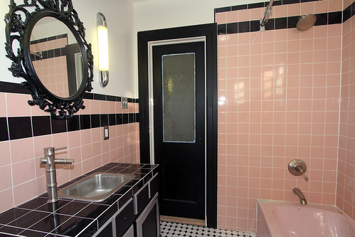
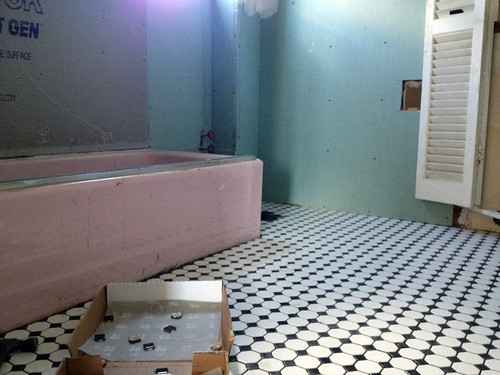
I wish every room could be as interesting as doing a bathroom or kitchen. Remember my original pink bathroom that I was determined to keep? Well, it has been resurrected! Still on the to do list: vanity pulls, scrape paint off door glass, lock set, stain saddle and a few other things that don’t show up in the photo.
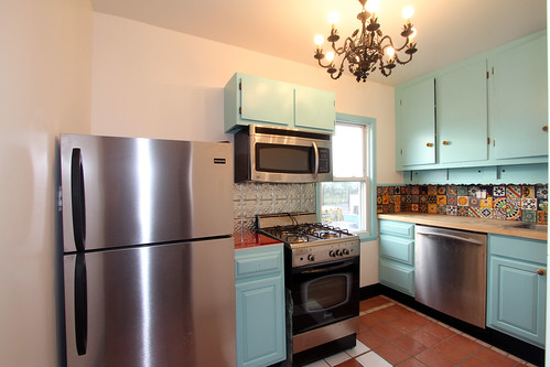
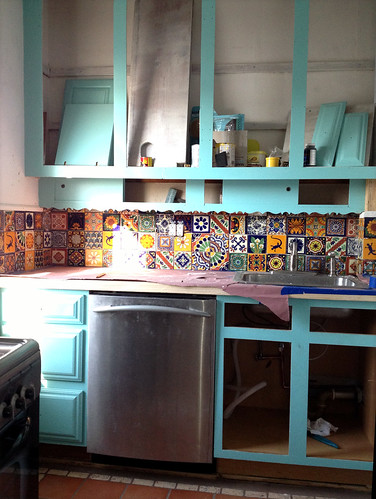
The decision to do a Mexican kitchen was born when I found the ceramic “terracotta” tiles at a Habitat Restore. The upper cabinets were there when I bought the house. Because of my not-so-great planning skills, the fridge, which was originally for the downstairs kitchen, was moved up here because it was too wide. It was meant to go on the opposite wall but proved too big for that also. I ended up tearing down some more cabinets to fit it in that corner. It works so much better there, but now I have to move an outlet. To do list: Move outlet, cabinet pulls, replace broken stove knob, switch plates.
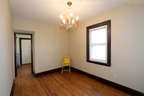
This is the living room. I stuck the chair in the photo because it looked so empty, but now it looks even more sad. To do list: Hang crystals from light fixture, re-coat window trim and inner white, switch plates.
This is actually the small front room, but it looks bigger than the living room in this photo. It can be a second junior bedroom, an office or child’s room.
The main bedroom is Manhattan sized also, but it has a room off of it with a closet that can act as a dressing room. Nothing at all interesting about this corner photo. I just wanted to show off yet another vintage light fixture.
Related: Apartment One
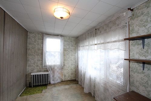
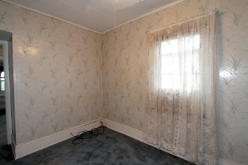
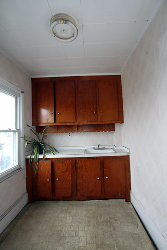
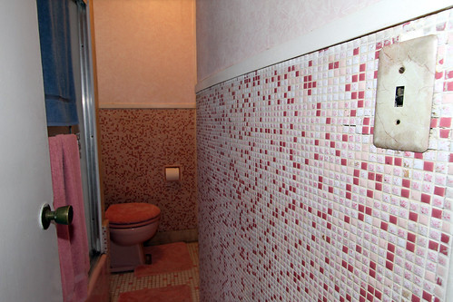
Here are some “before” shots…
Front Room
Living Room
Kitchen
Pink Bathroom
Mexican Tiles
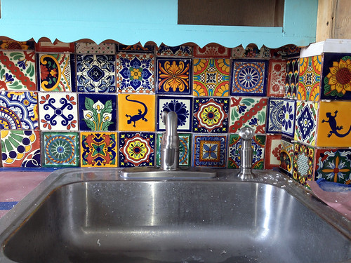
The Mexican kitchen in apartment #2 is coming together! Backsplash by eBay. $60 including shipping.
I decided to go Mexican when I found fake terracotta (ceramic) floor tiles at a Habitat for Humanity. FYI, 25 bucks. But then I ran out of them. Oops. Anyway, that set the theme for the entire kitchen.
The eBay tiles are mismatched, as you can see. Included in the box of 100, there were about 3-4 design repeats. Some are meant to be patterns that make up a single design but that design can’t be completed. Because they are handmade, none of them are the same size, which makes for uneven grout lines.
If consistency and perfection is your thang, these tiles ain’t for you. If you likey, just punch in a “Mexican tile” search on eBay and you’ll have a nice selection to choose from.
There are also these Mexican tile resources from an earlier post.
Creative Door Trim
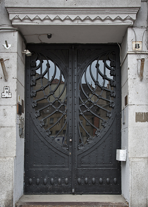
After having spent a couple of thou on molding for the entire house, my favorite trim was a result of righting a mistake and the cost was only 20 bucks.
This is the downstairs bathroom. Long story short, I had intended to do wainscoting on the lower wall and when I couldn’t find reclaimed I decided to do a faux effect instead (photo below). I don’t love it but that’s beside the point. Anyway, for some reason I was too lazy to continue the design all the way to the door, figuring that molding would cover it up.
Well, I don’t know what I was thinking. Your basic molding isn’t a foot wide. So, I’d either have to match the swirly design or get some wide ass molding.
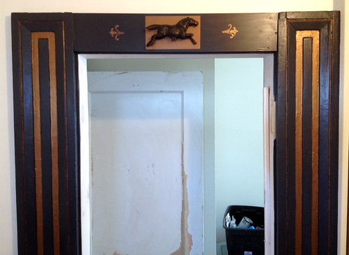
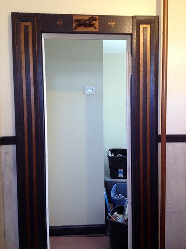
I went with the wide ass molding. Found these side panels at Build it Green. Now the problem would be finding a top piece. After weeks of searching to no avail (You wonder why this reno is taking so long?), I had to put a piece of 2×6 in there and figure out how to make it look nice.
The horse was left over from my crafting days. The black horse didn’t pop on the dark colored molding so I added the copper “frame”. Still looked boring, so I added the stenciling on each side. Now the sides looked lost. Shit, I just want to finish this renovation but I’m a sucker for the details! Soooo, I had to embellish the panels with some copper too.
This door is currently my favorite part of the house. Probably because it’s the only thing I’ve actually finished (and not even…I still have to caulk).
Pink Bathroom Stayin’ Alive
The same pink bathroom that sold me on this house was the very thing I had to say goodbye to during demolition. I vowed that I would keep that bathroom pink by any means necessary and I’m keeping my promise.
As you can see from the photo, the tub has been saved. It was touch and go for awhile because I wanted to move the shower body over to the far side of the toilet, getting rid of a wall that blocked the window. That means the drain is on the opposite end of the faucet. Since one side of the tub is against the wall, there was no turning the tub around. I started to search for right side (or is it left side?) pink tubs but then I said “Fek it. So the drain is on the wrong side.” That cast iron is too heavy.
The only pink floor tiles I found were pink and white and since I wanted a pink and black bathroom, I decided to pick up these Home Depot black and white mosaics which will make the pink pop. BTW, Weisman’s Home Outlets carries retro pink and white floor tiles as well as 4×4 wall tiles.
I cleaned Build it Green out of their pink 4×4 vintage wall tiles. Got about 300+ tiles and still have about 250+ more to go. Astoria and Gowanus tiles have slight color variations so I’ma gonna have to mix and match. Now I can’t buy new pink or black to match because of the thickness.
The pink toilet that was salvaged from this bathroom will be installed once the grout is applied.
Looking for a vintage dresser today to act as the sink vanity. This bathroom will be screaming 1950’s when I’m done. A far cry from the Victorian bathroom downstairs. The one that has been too messy to take pics because it’s actually in use.
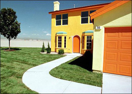
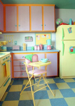
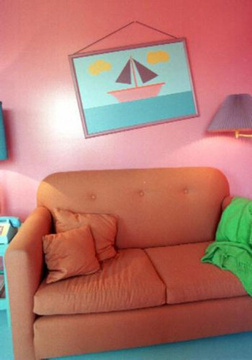
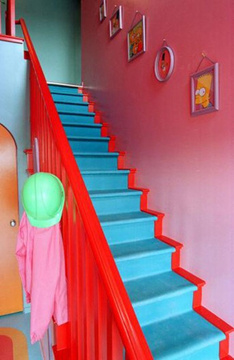
The Real Live Simpsons House
Can’t say the thought hasn’t crossed my mind to do a house in “Flintstones” style. But “The Simpsons“? Never considered the house to be anything special…until seeing it in real life. Now I totally want a cartoon house!
Via Gizmodo.
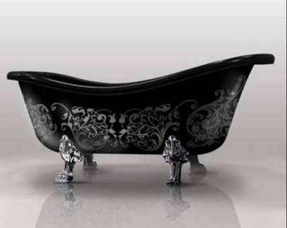
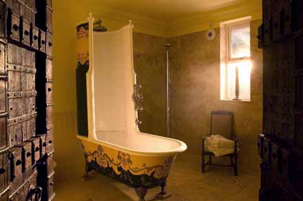
Stenciled Bathtubs
Decor by National Wholesale Liquidators
Before there were Ikeas and Targets in NYC, National Wholesale Liquidators was the place to go for inexpensive home goods. Right there on Broadway just a touch north of Soho (“Noho” my ass) was a three level megastore of savings.
NWL still exists in three boroughs and out in the suburbs. Hey, it’s the type of place where a car comes in handy to schlep all that merch anyway.
Although not quite as stylish as Ikea, it’s a great place to hit if decorating on a budget. They carry a decent selection of table linens, bath accessories, curtains, rugs and bedding. They also stock kitchenware and small appliances as well as large furniture.
Don’t need home goods? The New Jersey store even has a full supermarket and wine shop.
Recycling Old Ladders
Home Bars
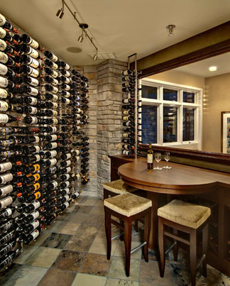
Doesn’t matter if you’re a big drinker or not. Home bars are pretty darn cool. Whether it’s a tiki bar or Mad Men version, what better way to entertain your guests than pretend you’re a bartender?
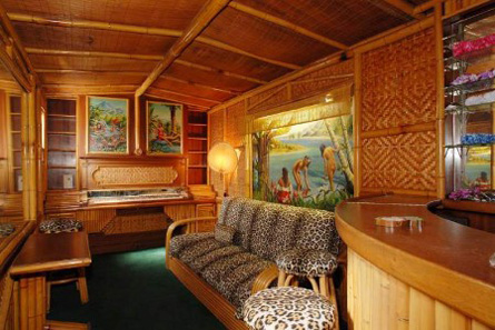
Who needs a tiki bar when you can have an entire tiki room?
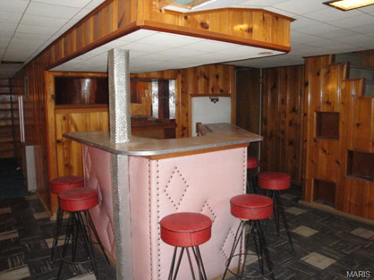
This cute pink bar was in a home for sale in St. Louise, MO. Entire home was listed at $55k.
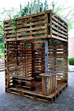
Outdoor pallet bar. How much does this cost? Oh yeah, free.
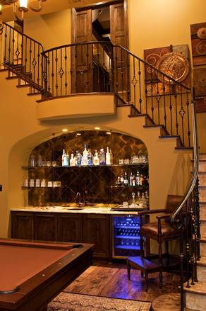
Ok, so the house is a bit McMansiony but the idea of putting the bar under the stairs is great. Plus, they have a pool table.
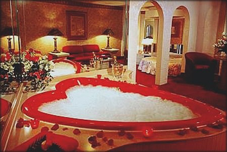
I Heart Hearts
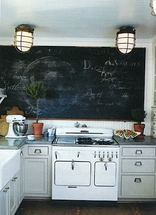
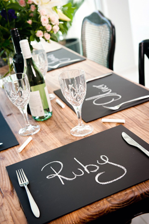
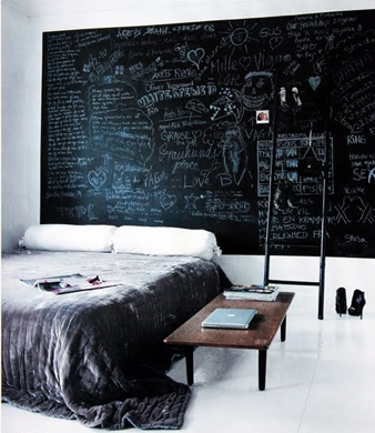
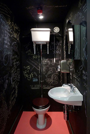
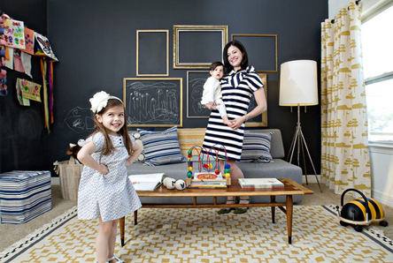
Chalk It Up
Light Fixture Fetish
It’s true. I have an addiction to light fixtures. I buy light fixtures like women buy shoes. They go with many designs, they are easy to carry and they won’t make you look fat. Plus, if it’s a bargain, who can resist?
Granted, I’m pretty sure I had enough lighting to cover the whole house, but I picked up three more fixtures yesterday at Vaccaro’s. Although the entire renovation is a potpourri of salvaged styles, the lighting is decidedly tole. I suppose I’m trying to achieve a kitsch bungalow look. I did buy some deco sconces and gothic chandeliers for good measure. Can’t be too consistent! It would get boring.
All lights need to be cleaned, painted and rewired. What fun would it be if I couldn’t work on them?
Tiny Kitchens
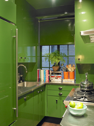
No space? No problem! There are some awesome design for tiny kitchens. The lime green tiny kitchen above was designed by Miles Redd right here in New York! It’s both functional and wayyyy cool.
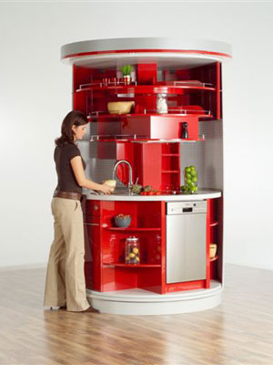
This circular kitchen by Compact-Concepts sort of looks like a public restroom when the doors are closed. (Note to self: Public restroom in home would be kind of suh-weet.) The German company doesn’t seem to have a dealer here in the US.
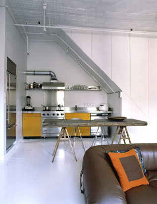
Under the stairs. Of course, there are no cabinets so you would probably be ordering lots of take out. Fine by me! Via Pinterest.
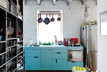
Via Apartment Therapy. I don’t care if it’s functional or not. It’s turquoise.


