Skip to content

Bklyn Designs: Robert Martin

Bklyn Designs: Robert Martin published on

foldtabledefault.jpg

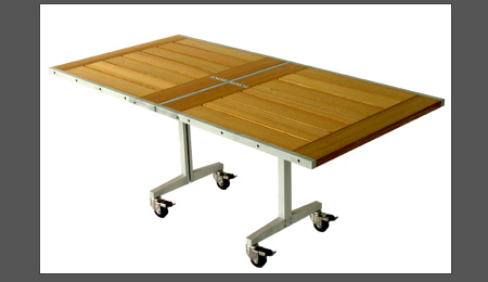
Ok, so Robert Martin Designs doesn’t use reclaimed materials for their furniture, but they are damn cool anyway! Pieces are made from hardwoods and enhanced with metals and composites.

The dining room table pictured above folds up completely. Designs for the home, garden and office have an industrial yet delicate look.

Robert Martin Designs has a 6500 showroom and production facility based in the Brooklyn Navy Yard. They do custom and architectural landscape work as well.

Bklyn Designs: IglooPlay

Bklyn Designs: IglooPlay published on

It was a weird weekend for me, so I didn’t get to the Bklyn Designs show as I had planned. Pardon me while I do a little cheating and highlight some of the exhibitors straight off the website this week. One-at-a-time. Stretch-out-those-posts.

rocker-maple-periwinkle.jpg

Mod Rocker: $292 at Mini Jake

IglooPlay is sustainable ergonomic furniture for kids. Designer Lisa Albin was inspired while observing her two daughters. From website: “I developed the low and wide proportions, organic shapes and ease-of-use to enhance the spontaneous and creative process that children naturally express in their daily play.” Although the furniture may look like something you would buy at Ikea (nothing wrong with Ikea designs!), IglooPlay uses only eco-friendly materials. That means safety for your children as well as the environment.

Here’s a list of shops that carry IglooPlay.

Retro Chicks

Retro Chicks published on 1 Comment on Retro Chicks

I must say, I’m having lotsa fun finding small vintage items for the flea market. Kitsch is my specialty. The uglier the better. I stick to classic Victorian in my own home, so this is a great outlet for me to let loose. In search of “kitsch decor” I stumbled upon these fine websites that I’ve added to my blogroll.

cropped-50spam7.jpg

Retro Renovation

This wasn’t a new discovery. I’ve written about her in the past, but for some reason I never included her in my blogroll. Shear laziness. Oops.

weir53kit.jpg

Frisk the Fridge

retromodgirlblogbanner.png

Retro Mod Girl

blogcollagegrey4.jpg

Vintage Goodness

Virtual Faucet Creator

Virtual Faucet Creator published on 1 Comment on Virtual Faucet Creator

faucet.jpg

Create your dream faucet! California Faucets offers online design software that allows customers to choose any handle, spout and finish they desire. You can start from scratch or modify an existing faucet.

Once finished, you print it out and bring it to a dealer, where they order your custom design. It would be even better if you can just shoot it off to them via the internet.

I don’t need a faucet at the moment but I want to do it just for the heck of it.

Via Materialicious

Washing Machine N Toilet Combo

Washing Machine N Toilet Combo published on

washup.jpeg

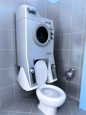
WashUp is merely a concept at the moment. Sevin Coskun of Turkey entered the design into the Greener Gadgets Competition this year.

The idea is to store wasted water from the laundry in the flush tank to be reused later. Also a great solution for small apartments.

Just don’t forget to lower the lid before unloading clothes!

Via Trendhunter

Recycled Switchplates

Recycled Switchplates published on 1 Comment on Recycled Switchplates

I usually try to find vintage switchplates on Ebay or I embellish existing ugly ones with wallpaper scraps or antiquing techniques. But I wanted to see what else is being offered out there. So, here are some recycled switchplates: all too pricey for moi.

crosshatchcircle_1.jpg

Eleek makes some gorgeous plates. Not cheap though. The “Crosshatch” pictured above is $68. Using these for every switch in your house would cost more than a used car. Perhaps not, since they don’t make outlet covers.

borisbally.jpg

Boris Bally designs these football shaped switchplates using recycled street signs. I can see them in a few rooms, but not all over the house. Don’t get me wrong….I like them. But they scream teenage boy’s room to me. $39.99 at Green and More.

campbells.jpg

Tin Can Sally makes her switchplates out of…you guessed it. Although most of them look “kitcheny”, perhaps the plain tin, which I actually prefer, can be used all over the house. Her designs average $22, which seems like a steal compared to the other companies.

circuitplate.jpg

Etsy designer Debby Arem uses circuit boards for her switchplates. Some of the colors are really nice, but I prefer the plate pictured above because it’s not obviously a computer part. $28 for the 3 switch cover.

Shedworking In Upstate NY

Shedworking In Upstate NY published on 13 Comments on Shedworking In Upstate NY

garage.jpg

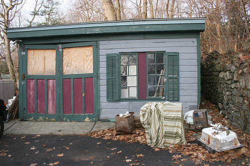
Remember our kooky garage? Well, we really need to replace it this Spring (Or Summer. Or Autumn). My original plan was to do a carriage house that is an exact replica of our home. Now I’m open to any option as long as it’s fast. Enter Shedworking UK.

Here’s where I don’t tell you that the original reason I contacted Alex at Shedworking was to get some technical advice on how he uploaded that Plywood Chateaux video. Do you see the video on my site? Nuff said. Blogger is more user friendly than WordPress.

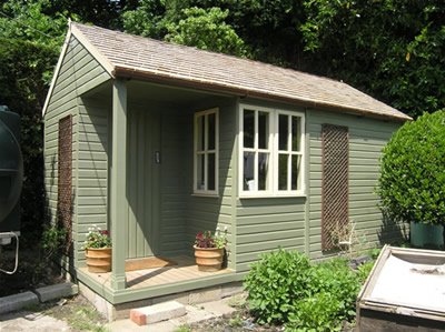
Anyhoo, after way too much time spent on Shedworking, I came away more confused than when I started out. So much to look at! So, here’s what I’m gonna do. Below are some really cool options. Lemme know what you think. I want sort of a work space/guest house kind of thing. This is just in the research phase and would still have to pass DOB and hubby approval. We would reuse the siding and doors for this or some other project.

ext2finished.jpg

A How-To article to get the creative juices flowing. The only thing we ever built from scratch was a bathroom extension, so this should be a fun little project.

slide08.jpg

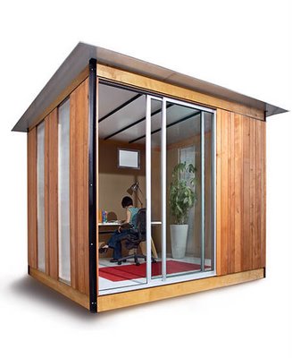
San Fransisco based company Modern Cabena has some nice designs. Too modern and too small for our needs, though.

ancaya1.png

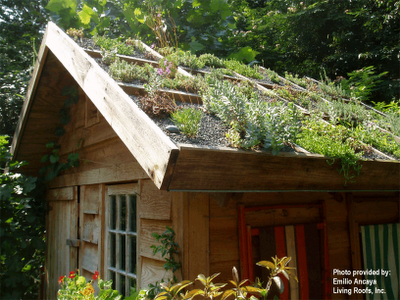
I’ve written about green roofs before but never considered it for our own homes. Hmm, if we can’t keep house or outdoor plants alive, would this be a mistake?

henhouse.jpg

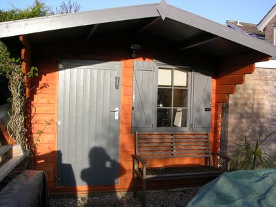
This West Sussex based company, Cock-A-Hoop, has some sweet designs and their prices aren’t crazy. Ok, so delivery might be an issue, huh?

moonhouse.jpg

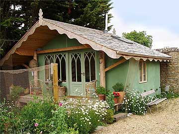
Guy Martin, another UK company. But how cute is that garden house?

5gardenoffice.jpg

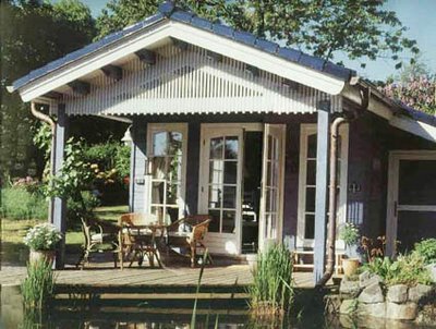
Nordic Lodge, again, straight outta da UK.

Wednesday Linkorama

Wednesday Linkorama published on 1 Comment on Wednesday Linkorama

coneyisland.jpg

Get your kids involved with your DIY projects! Why shouldn’t they help out? Playhouse Design Competition For Kids over at Choochicoos. Deadline April 25th.

Things you should know about wetlands on your property. Living Well in Westchester talks about building additions while protecting the natural habitat.

You MUST watch this video on Materialicious. It’s about 5 minutes long and will make you all teary eyed. Dan Phillips built his home out of 85% recycled material and helps others realize the dream of home ownership. All they need is a credit history and a job. Could be minimum wage. They must help build their own recycled home, but experience is not mandatory. This is in Texas, of all places.

Here’s another cool video, this one from Brownstoner. Coney Island in the 40’s. My parents would take me here when I was a kid in the 60’s and this video put a smile on my face. Some of these things still existed in the 70’s. Unless my warped mind is remembering something completely different. Laughing Lady/Fun House? Was that Coney Island?

The Brooklyn Blogfest is May 8th at the Brooklyn Lyceum! Mark your calendars. So you can remind me to go. Non-bloggers are welcome also. Only The Blog Knows Brooklyn will keep us posted as the plans progress. Last year’s Blogfest was sponsored by Partida Tequila and there were margaritas galore. They’ve yet to find a sponsor for 2008. Hello Stoli?

The Kitchen Designer posts her top 10 secrets of lighting design. “Lighting is jewelry.” Yes! I totally agree. But you can live without jewelry. You can’t live without lights. Unless your own of them kooks who doesn’t like modern conveniences.

$6000 Dog Caves

$6000 Dog Caves published on

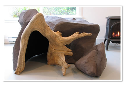
sr02img.jpg

Scottie’s Fine Art Caves is a Canadian design/build firm that specializeds in Interior Art Homes for companion animals.

If you haven’t already guessed, Scottie is a dog. The 12 year old Maltese/Yorkshire terrier is CEO of the company. Scottie was the inspiration behind the cave homes, so why not? The VP of the company is a cat. Some guy is also involved.

The Art Homes are stamped for authenticity. I can’t imagine what the resale value would be after sitting in a house full of chewing dogs and scratchy, peeing cats.

The Caves are made with environmentally friendly materials. Ingredients include water, cellulose fibre, wood, natural fibre rope, and water-based paints. These are meant for interior use only. But then again, who in their right mind would keep a $6000 object outdoors? Or their dog for that matter?

Feline mountain is available for kitties.

via Cribcandy

Stone Fruit Floors

Stone Fruit Floors published on 1 Comment on Stone Fruit Floors

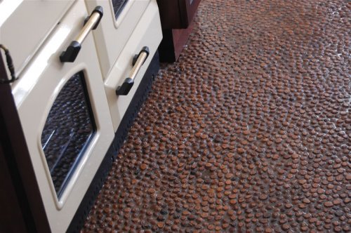
peach.jpg

Alla le Roux came across his first peach pit (or “pip” as they say in South Africa) floor at the age of six when his parents took him to Klein Zoar in Cape Town.

When Alla purchased an 1860 home years later, he remembered those floors. After much trial and error, he successfully laid his flooring. He registered the design in 2007.

The home in Paarl is now an art gallery called The Orange Mill. The floors were so popular that Alla and his partner Liz entered it as a business concept in the FNB Enablis Business Plan
Competition. They were finalists.

The floor consists of peach pits that are packed by hand onto a glued surface and filled
with a silica sand and resin mix, then sealed with a twin pack urethane. Sharp edges are ground down exposing the red hue. Design and color can be customized.

I’m not sure if you can order this in the states yet, but if you enjoy your peaches and you feel like taking on a project, go for it!

Via Inhabitat

Stone Fruit Floors

Local Glass Tile

Local Glass Tile published on

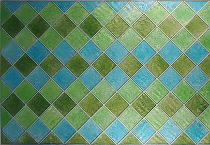
m-lume-mo-ag-ca-panel.jpg

FYI: There’s a glass tile manufacturer right here in Beacon. The Architectural Glass tiles are constructed of new material but the company does their best to reduce waste during processing.

The 4″x4″ Lume Series is a machine made tile that comes in 20 vibrant colors. These 3/8″ thick tiles are comparable to today’s ceramic tiles except they are much more beautiful. And more expensive. If a whole wall is not an option, they would work nicely as accent pieces.

The Studio Series is hand made. Each 4″x4″ tile is 5/8 thick and comes in a variety of colors. There is a rope accent piece that is to die for. I’ve seen them in person. Trust me, the website doesn’t do them justice. Obviously pricier than the Lume Series.

Architectural Glass also offers custom tiles. These are the same folks behind some of the work at Hudson Beach Glass, one of the most inviting galleries on Main Street, Beacon.

2006 Interview

A Walk Around My Big Fat Ass

A Walk Around My Big Fat Ass published on 12 Comments on A Walk Around My Big Fat Ass

A Walk Around the Blog” Reclaimed Home segment with architect Mark Helder
has been aired. I told myself I wouldn’t post the video if it’s too embarrassing, but I just had to share.First of all, when they say TV puts 10 pounds on you, they ain’t kidding! I’m not that fat! My ass takes up the whole screen!Ok, and what’s with my goofy smile? Can ya tell I felt alittle self conscious in front of the camera?

And do I really sound like that? I think I was trying so hard not to sound “Brooklyn” that I sound…I dunno….like, Valley Girl? How about that voice over where I’m obviously reading from a script in the studio after the taping?

Ok, enjoy the laugh. Hope you don’t have nightmares about my Godzilla thighs.

And then let’s forget this whole thing ever happened.

439 Metropolitan -LEED Platinum Pt II

439 Metropolitan -LEED Platinum Pt II published on 8 Comments on 439 Metropolitan -LEED Platinum Pt II

block.jpg

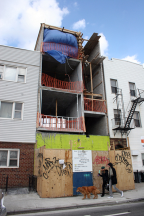
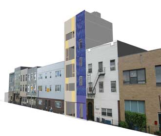
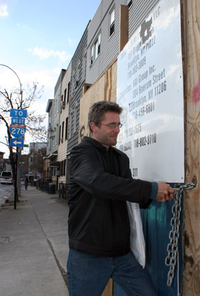
Last December we reported that NYC’s first LEED Platinum mixed use building project was underway in Williamsburg. I recently visited the site to interview architect Mark Helder for BCAT Brooklyn Review’s A Walk Around the Blog.

439-1.jpg

The building is slated for completion by July 2008. That seems a long shot at the moment (see photos), but Mark assures us that the most difficult part is behind him now. Because they saved the existing walls, underpinning the foundation was an arduous task.

439-8.jpg

The building will house Mark’s design studio on the ground floor and cellar and will have two residential duplex units above that. The first unit will be about 820 sf and the penthouse, about 1050 sf. Each apartment will have a private balcony and in addition, the penthouse will have exclusive use of the roof garden.

Because of the space constraints, the building was designed with as thin walls as possible while not sacrificing thermal or noise benefits.

I thought it was interesting that the greenest building in Brooklyn sits right near the BQE. But then again, that’s the ONLY kind of building that should be situated there. 100% of the ventilated air will be filtered to near HEPA standards. The building will have one of the best indoor air qualities in the city, far exceeding the American Lung Association’s standards for their Health House certification.

Heavy laminated glass windows will mitigate noise pollution. Concrete floors with an acoustically insulated radiant floor slab will further help with noisy neighbors.

See the blue on the front of the building? Solar panels.

mark.jpg

Mark Helder moved to the states from Amsterdam when his wife Nikki felt it was time to reconnect after being away for a decade. Whenever he would visit NYC, he always looked around in astonishment at the abundant building opportunities. Lots of empty and smaller spaces and in general, an aging building stock with opportunities for improvement.

He also noticed that building technology followed the money and was of low standards as compared to what he used to in the Netherlands. Even though there were budgetary constraints back home, it seemed to him that the quality was higher even in the very low budget segments of the market. He feels it’s just what people are used to / demanding to get for their money.

Mark goes on: “In that sense it’s easier building green in the Netherlands, first, because it is a national consensus and people are aware of the long term maintenance effects when building a building which lasts for at least 50 years. Second, building standards and codes are kept up-to-date to the current (energy) developments. The minimum energy efficiency requirements are set to a relative high level in relation to the regularly available building technology and is updated every few years or so. In the US the minimum energy standards are relatively low and building a better performing building is basically voluntary. The gap between the minimum requirements and the regularly available building technology is large.”

open.jpg

Brooklyn Review airs Monday, March 10th on Time Warner channel 56 or Cablevision 69. Check listings for encore presentations. I’ll post the video here if it’s not completely embarrassing.

workclothes.jpg

The Art Hotel: Carlton Arms, NYC

The Art Hotel: Carlton Arms, NYC published on

hotel0005.jpg

Photos by Darek Solarski

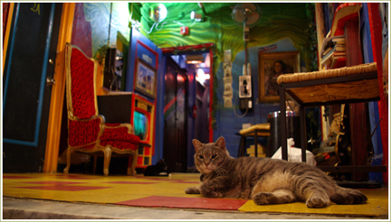
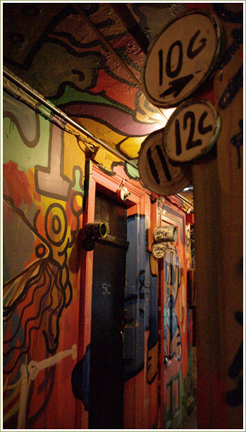
I came across a funky fantasy hotel on Blog Like You Give A Damn, but it was in the Midwest. So I did a little search of theme hotels closer to home and came up with one right here in NY.

I’ve heard of The Carlton Arms and I think I even know someone who stayed there once (my couch must’ve been booked). What I didn’t realize is that it’s so cool inside. Not only are the walls covered with colorful murals, this is a budget hotel. With rates starting at $80 per night, what cheap ass relative would pass this up? (My relatives, that’s who)

The Gramercy Park 54 room hotel has been around for about 100 years. Original clientele included out of state farmers and businessmen who parked their horses in the carriage barn next door.

During prohibition, the Carlton lobby acted as a speak-easy with gambling taking place in the upstairs rooms. It became a respectable hotel again for a while until the 50’s when it became a hang out for drag queens, prostitutes and drug addicts. Not that drag queens can’t be respectable.

Like so many other NYC buildings, including my own, The Carlton became an SRO during the 60’s. By the 80’s, it had hit rock bottom, with a steady clientele of pushers, junkies and nut jobs.

Ed Ryan took over the place when the owner had a mental breakdown. As rooms vacated, he cleaned them up and rented them to travelers looking for inexpensive lodging. In 1983, front desk clerk, artist Gil Dominguez painted a series of murals. Other artists came and followed suit in the rooms.

John Ogren and Ty Inwood took over the hotel in 1998. Now it’s mostly young European and Asian hipsters staying there.

hotel0049.jpg

hotel0525.jpg

hotel0120.jpg

hotel0226.jpg

Green Furniture on a Budget

Green Furniture on a Budget published on 2 Comments on Green Furniture on a Budget

green_furniture_fsc.jpg

The Lazy Environmentalist posted an article last week entitled “Green Furniture For All Budgets”. I thought “Hey, this is great!” I love Vivavi’s designs (The company behind the Lazy E). I just can’t afford them.

But alas, there was nothing for my meager budget in that article. I have a few theories as to why this is so:

1. Everybody out there is earning WAY more than me and the hubby. Ok, I’m a freelancer and winter is my slow season. I’ll give you that. But hubby? Steady paycheck. Decent salary. We’re DINKY’s. I dunno.

2. I’m extremely cheap. This is true! Only cheap with certain things. I will blow $300 on a dinner for two, but I would NEVER spend over $30 on a sweater. I let the hubby do that. And then I wear his clothes.

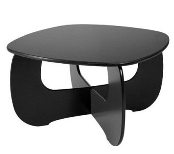
3. I don’t see the value in “new crap”. Give me antique over modern any day of the week. That Target coffee table pictured above is $339. Can I afford it? Yeah. But it looks cheap to me. I could pick up a great coffee table on Craigs for under $50. And it would be green because it would be recycled.

LE states that it is getting easier as there are more options for the consumer now. True, but I still don’t think it’s affordable to everyone. Case in point, the green Crate and Barrel sofa he shows listed for $2299 and the Vivavi sofa for $4200. I’m not sure if he was trying to say these are affordable, but if so, he’s out of touch with reality. Or maybe I am?

As someone who is cheap, first and green, second, I make up my own rules.

1. If it’s second hand, it’s green. Save it from a landfill. Recycle it.

2. If it’s a closeout or liquidation, it’s green. You’re not buying a new product that will need more production. They are just trying to get rid of what was already made.

3. Leftover materials from other’s jobs=green. People/contractors often order too much flooring, sheetrock or tiles and sell off the remaining for half the price. Take advantage!

Now, if you’re looking into green options because of health concerns, you will have to go with the formaldehyde-free, non toxic choices. But if it’s for the environment, then why can’t RE USE be the #1 rule?

So, there you go. It’s easy to be cheap (or poor) and green!
Primary Sidebar