
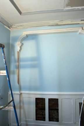
It’s finally happening. I’m painting my living room! At least one small corner of the living room where the hubby will install our kitchenette next week (or the following week, or the one after that). Thanks to all of you who helped with my color decision. Here’s how it’s turning out:
I went with blue walls and white wainscoting instead of my initial desire to have the reverse. Instead of a pale blue, I went with something more vibrant. I’m not the most subtle person in the world, so why should my walls be? I was inspired by a “House of the Day” on Brownstoner that I couldn’t get out of my mind. They painted nearly every room blue! But I could only find one photo left on the internet. When the husband walked in and saw the color he asked if we had a boy.
My living room. Not.
Originally, I really wanted to make the detail in the wainscoting pop with a glaze or a second color. After a few tests, I decided I liked a clean look better after all. I’m stripping 60 some odd years of paint off, but I still don’t have the patience for perfection and by adding a second color, I only accentuated the flaws. So wainscoting is the Behr Swiss Coffee from Home Depot. No patience to wait for color mixing either. Right off the shelf!
Here’s where I need more HELP. Ok, so the ceiling is going to be white. What color should I do the plaster molding? I don’t want all white, but when I tested other colors, I wasn’t grooving to any of them. I did the corbels in a darker blue, with some metallics, but I forgot to take a picture. Don’t know if I’m going to keep that anyway as I think I’d like to go with more of an accent color. Here’s some more info to help you help me: We have a red couch. Ok, what color?? I want glitz!
About the paint:
I went with “Midwest Spring” from Home Depot’s No VOC Fresh Aire Choice. The color looks much more intense on the wall than on the paint chip, but my motto is “Once I start, I’m not repainting.” The first coat looked very patchy and I thought “Oh crap, this is worse than Ralph Lauren paint.” But the second coat filled in nicely and I got away with 2 coats in that dark corner. I liked the paint, but not enough to spend the $10 extra per gallon to use it for everything. Sorry, Mother Nature, my pockets aren’t deep enough to save your ass on my own.
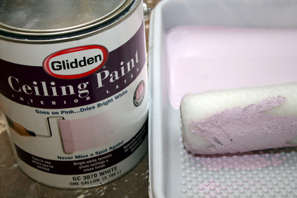
For the ceiling, I spent an extra $3 for the gimmicky “goes on pink, dries white” paint. First time I used that. It does what it says and it’s a cool idea for anyone who hates straining their neck to paint the ceiling as much as I do. Your neck will still hurt, but at least you won’t have to do five coats to cover the spots you missed.
Unfortunately, it wasn’t the most productive weekend. Time spent thinking about it, prepping, buying paint and supplies: 3/4 of the weekend. Time spent actually painting: maybe an hour or two. And I wonder why I only got one corner done.
4 Comments
The blue looks most excellent. How about swiss coffee for the molding, too? Or too matchy matchy? I’m worried that introding another color and a red couch could be tricky?? If glitz is what you want I would totally go metallic. Gold. (Or silver if that’s what your light fixture will be.).
Ralph Lauren has some awesome metallic paints at Home Depot. Go for silver!!
I can always count on you two! I don’t know if you can tell from the photo, but that vertical corner molding is a warm silver. I love the color, but maybe I’ll go with something a little lighter for the ceiling molding. I want the molding to stand out from the ceiling so I don’t want to go white (or Swiss coffee) on white. I’m thinking of stealing one of the fixtures from the upstairs apartment. I think they’re brass. In it’s place, they’ll get a better fixture because they have higher ceilings.
[…] my blue Bed Stuy living room? That post was back in July. Here we are four months later and I’m still stripping the […]