
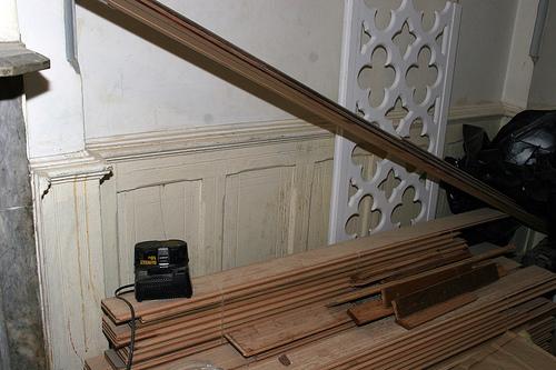
As is. Cracked, caulked and caked with paint. We’ll be making radiator covers out of that fancy piece leaning against the wall.
____________________________________________________
Ok, I need your help. Think of this as a poll and your vote will be counted by leaving a comment. Here’s the deal: I usually like dark, gothic looking rooms. I’ve done 3 of the 4 floors in our brownstone with darker walls and stained woodwork and I love it. But I’m bored with that already. I want to shift gears with our apartment. Not to mention that this is the garden level and doesn’t get a lot of light.
I wasn’t sure what I’d find once I started to strip the wainscoting. I uncovered oak with a base coat of brown so it’s nice and patchy and soaked into the wood. This being held together by caulk over the years. Some panels are broken in half and held together by plaster. Not surprising and definitely in line with what I found around the rest of the house. The question is, do I want to restore the wood or just paint it?
I’m thinking paint. Actually I’m beyond the thinking stage. I started to prime it. I’ll have to strip the 50+ years of paint off of all the wainscoting anyway because the details are lost. It kills me that I’m going to cover it up again, but it’s just too much work to have it look eh and make the room dark.
Which leads me to my poll. I’m thinking of a Hollywood Regency meets Victorian meets Art Nouveau look for this room. I’d like to have white walls to bounce light around and color for the wainscoting. I can be persuaded on this matter as I did prefer white wainscoting and colored walls on those internet color simulator things.
Any painted molding in the rest of the house is a deep (brick?) red. Too dark. And I’m sick of it.
Originally I thought yellow. Now I’m over that. It’s my least favorite color.
Now I’m onto a powder blue….like the Volkswagon Beetles. With maybe a gold or silver for the inlay.
Any input would be greatly appreciated!
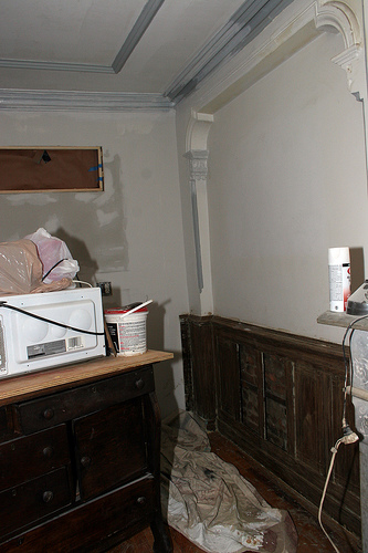
Not fully cleaned yet in this photo, but you can see it’s going to be a job to get it to look good. We’re turning that server into a “kitchen sink with counter top”.
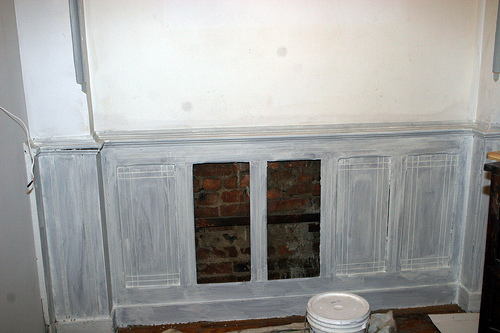
All primed and awaiting a color! So, what say you?
14 Comments
Wow, really gorgeous. Have you considered varying shades of grey?
Hmm, I haven’t used grey paint in a long, long time because my rooms as a tween and teen were always grey (my choice). Brings back memories of Starsky and Hutch posters, unrequited love and pints of Haagen Dazs. I suppose I can move forward and revisit that color.
Take a look at Benjamin Moore’s Patriotic White — it’s actually a very light blue…can look greenish depending on how the light hits it, and it plays well off of “non-natural” light to really brighten the space. I tested a million colors and used this for our main living space for the same reasons you say: dark woodwork everywhere, needed to open it up, etc. Why not white wainscoting (not boring – crisp!), then a light blue on the non-wainscoted part of the walls, with silver/gold for the inlay.
I’m usually way too lazy and impatient to test colors, but I might have to in this case. Every photo I’ve seen, I prefer white wainscoting with color on the walls, however, the photographer in me is saying the light is going to bounce better off the upper walls. Maybe I could do one side one way and the other side the opposite and then take a light reading and see if there’s a real difference in light reflection? Of course I’m not really that anal!
“Maybe I could do one side one way and the other side the opposite and then take a light reading and see if there’s a real difference in light reflection?”
— OMG…I’m buying you a cocktail. 😉
I’ve also noticed a lot of places painting the wainscoting the same color as the walls — and I really like that look…
I love a combination of a linen white for the wainscoting, and a pale robin’s egg blue- lighter than the actual color- maybe 50%- for the wall, and then a warm silver, actually almost platinum for the inlay. You could also think about a soft (Behr) sesame color for the inlay too. It’s a warm greeny-tan. hard to describe, pretty in person..
If you want to do something a little differnt, you could try using the blue as a wash over the white to bring up the detail, but since you’ve salvaged the natural wood in the rest of the house, have a little paint fun here.
Of course you could also bleach the oak or use a white stain so you see the grain but the wainscot is white.
Thanks! “Robin’s Egg Blue” sounds pretty. Don’t know what it looks like in person, but I’ll check it out. I hope I’m not just leaning towards cool colors because it’s so damn hot out! I usually like to use warming colors in a room. Yeah, I’ll be painting it fire engine red come winter.
I like the idea of white wainscoting. I have a very dark hallway on the ground floor of my limestone, and painting the tongue and groove wainscoting white made it pop. It’s a shade warmer than optical white, which was actually someone’s Home Depot reject, which I got for $5. It was perfect. Nothing short of movie lights will make the hallway light, so I decided to go dark English Victorian estate on the walls, and sponged a combo of navy, hunter green, gold, copper and silver on the walls, washed with a tobacco glaze to look as if it had been there since Lincoln. It’s not for everyone, but I like it. My preference is for darker, warmer colors, as well, but it can get depressing if everything is like that.
Back to you – I like the idea of white wainscote with a light wall color, very light blue, sea foam, or spring green. I would then jazz that up with a stencilled jacquard pattern, perhaps adding texture by using joint compound to make the patterns, and washing them with a subtle silver glaze. I’m very much into texture and pattern these days, and like doing the unexpected. Just putting a single color on the wall never seems to be deep enough. I want people to look at the walls and try to figure out what’s going on. (Hopefully that will distract them from the other things not done, or miss the dust monsters rolling by.)
Back to say I have a similar screen. Making radiator covers is a brilliant idea. Thanks!!
“I would then jazz that up with a stencilled jacquard pattern, perhaps adding texture by using joint compound to make the patterns, and washing them with a subtle silver glaze.”
Thanks for the offer! Ok, when do you want to come by?
Ok, white wainscot, light blue walls. Done.
http://www.designamour.com/
I love this woman, and her business.
While there are many great ideas, check her June 30th entry for the look I was talking about: pale blue with silver textured damask. It could be a fun project, we’ll talk.
OMG, why did you show me that blog? You’re BAD!
[…] next week (or the following week, or the one after that). Thanks to all of you who helped with my color decision. Here’s how it’s turning […]